
For my internship at ASM Research, I worked on a 4-month project with the UX team to design a website under one of ASMR’s major departments, MEDCHART( Medical Electronic Data Care History and Readiness Tracking). I designed an E-University to centralized a learning space at MEDCHART by providing direct lessons and official government required assessments in one space. The contract had not officially started, so I was unable to perform formal user surveying and interviews. However, with the resources I obtained, I underwent a UX design process to create a Mid-Fidelity prototype to propose to head of MEDCHART.
My Team
Year & Duration
Tools
My Roles
Overall Process
• 1) Research • 2) Identify Problem Areas and Solutions • 3) Ideation & Sketching • 4) Low Fidelity • 5) Prototyping • 6) Validation
Research
Client Requirements
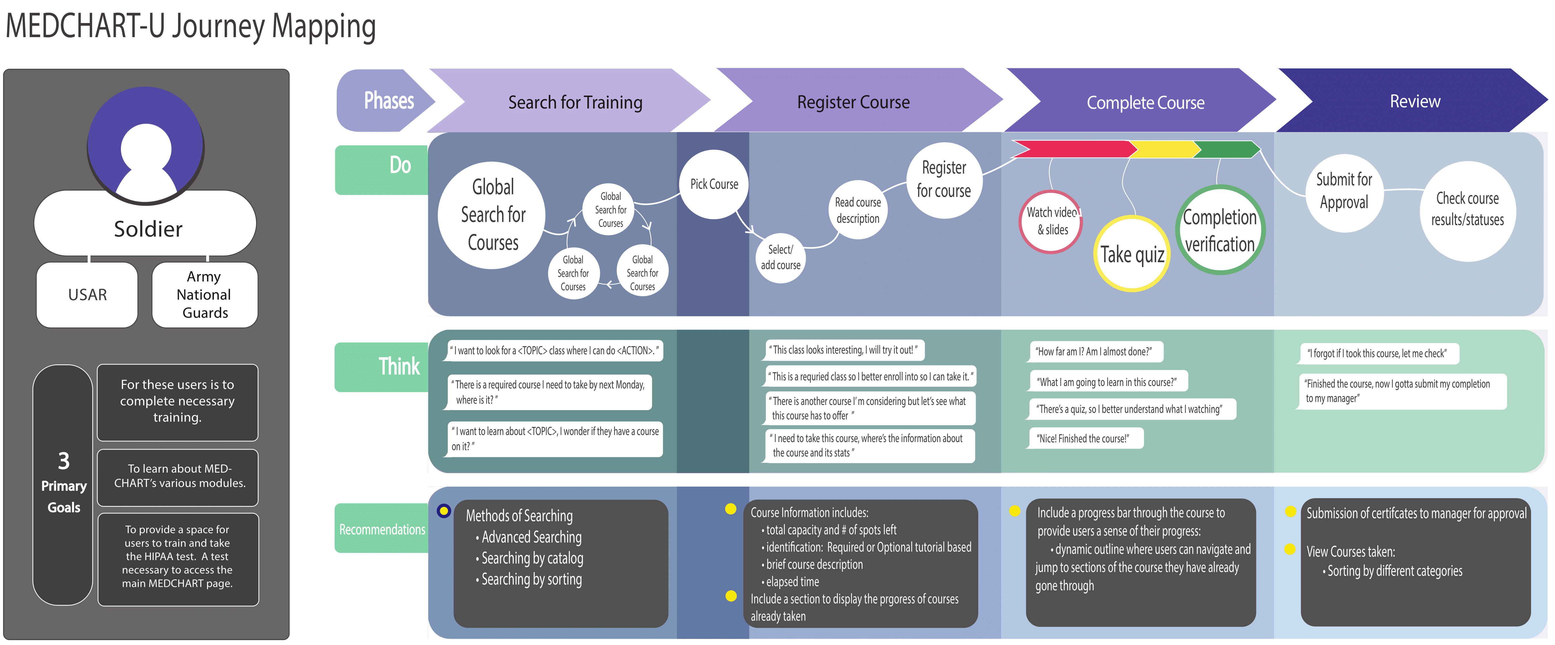
Army National Guards (ARNG)
Army Reserve
To maximize the efficiency of MEDCHART application usage.
1.
Currently no electronic system that provides MEDCHART users access to CBT (Computer Based Training)
2.
The current HIPAA CBT system is restricted to HIPAA CBT training and does not support CBT expandability.
Trainee User
Managerial Controls
*Roster = Officially name for a course
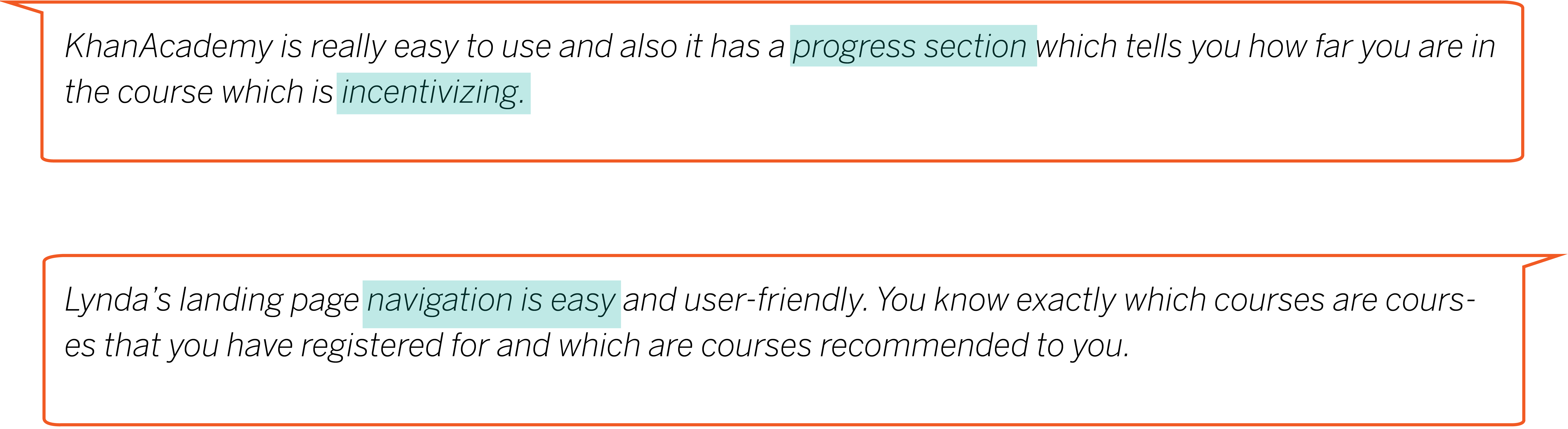
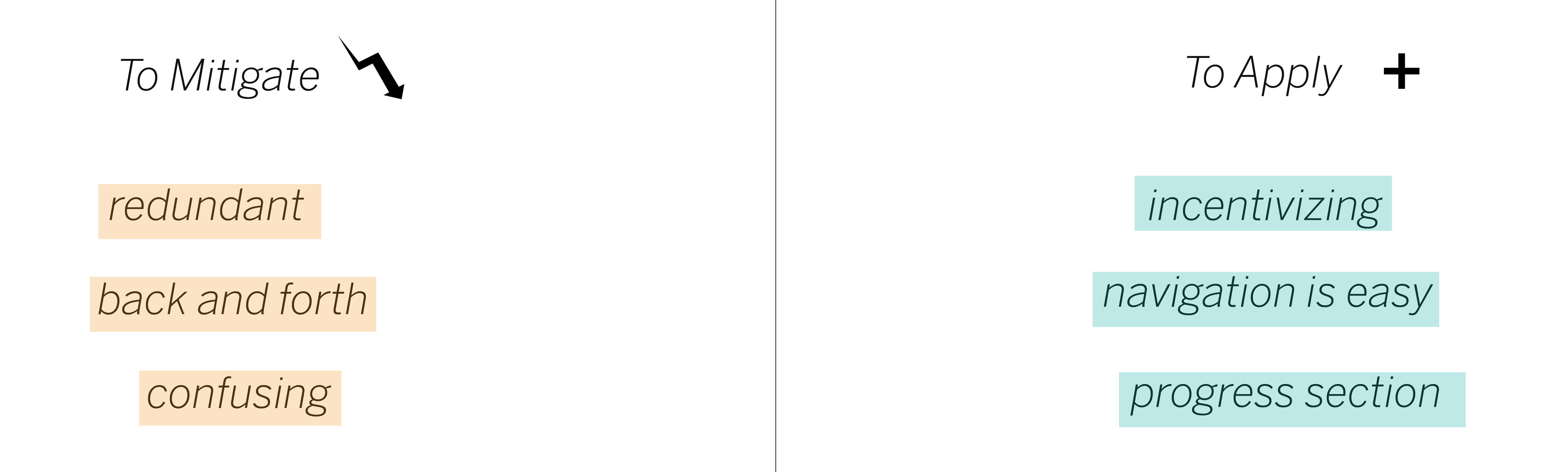
User Surveying on ASM-U* and other similiar tools
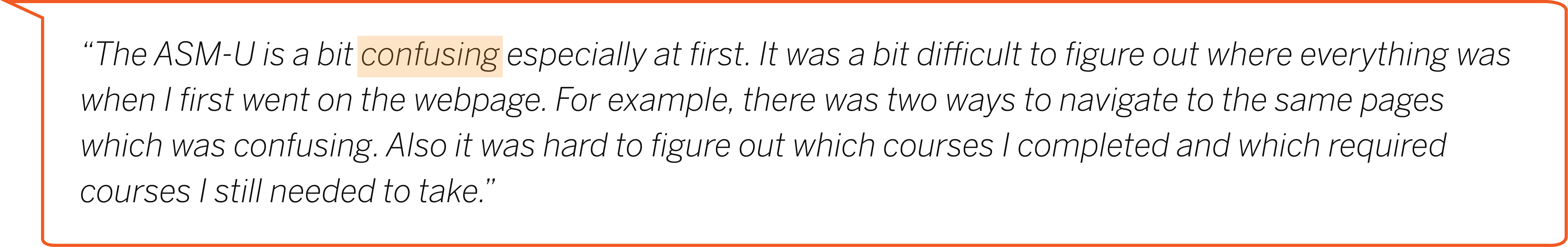
*ASM-U is a E-University platform currently used by ASM employees to get required employee coursework completed. The concept of ASM is very similair to what MEDCHART-U will be.

"Problem Scope"
Goal
Ideation
To lay out the foundation of the website, I created a high-level journey map which portrays the journey of the superusers: National Army Guards and the AMRG, to visualize the general navigation of the site.
Since my goal was not to redesign a pre-existing website, I did not include the user testing portions of the traditional journey map. Instead, I laid out possible thoughts the user may have to theorize a realistic sense of the user's journey through the website.
Information Architecture
1st row: 4 Phases, 2nd row: Main pages, 3rd row: Components, 4th row: Features.
With a general 4-step flow of the user's journey through the website, I began to settle on the physical pages that would correspond to each phase of the journey map.
Using sticky notes, I used the card sorting method to layout each level of MEDCHART-U's information architecture. The first row of this tree diagram structure are the 4 phases. As the tree branched out, each level became more specific.
Main Pages : Home Landing Page, Roster Catalog, Roster Overview, Roster, My Progress
Iterative Design Process
With the main pages settled, I worked with my team to decide on the best layout for each page.
To demonstrate the iterative design process, I will showcase the iterative process conducted on the Home Landing Page.
For the landing page, I decided on a two-column layout with the summarization of information on the left column and more detailed information on the right column.
The changes I made between the first and the final iteration focused on reducing redundancy and confusion in terms of navigation. Specifically, having two routes to view notifications would lead to confusion as there would be no direct relationship between the nofitication bell and bar. Thus, removing the notification bar in the 1st iteration would reduce confusion.
Solution to the Goal
1. Simplification of the pages: How to reduce the number of pages and prevent duplicate pages with the same functions
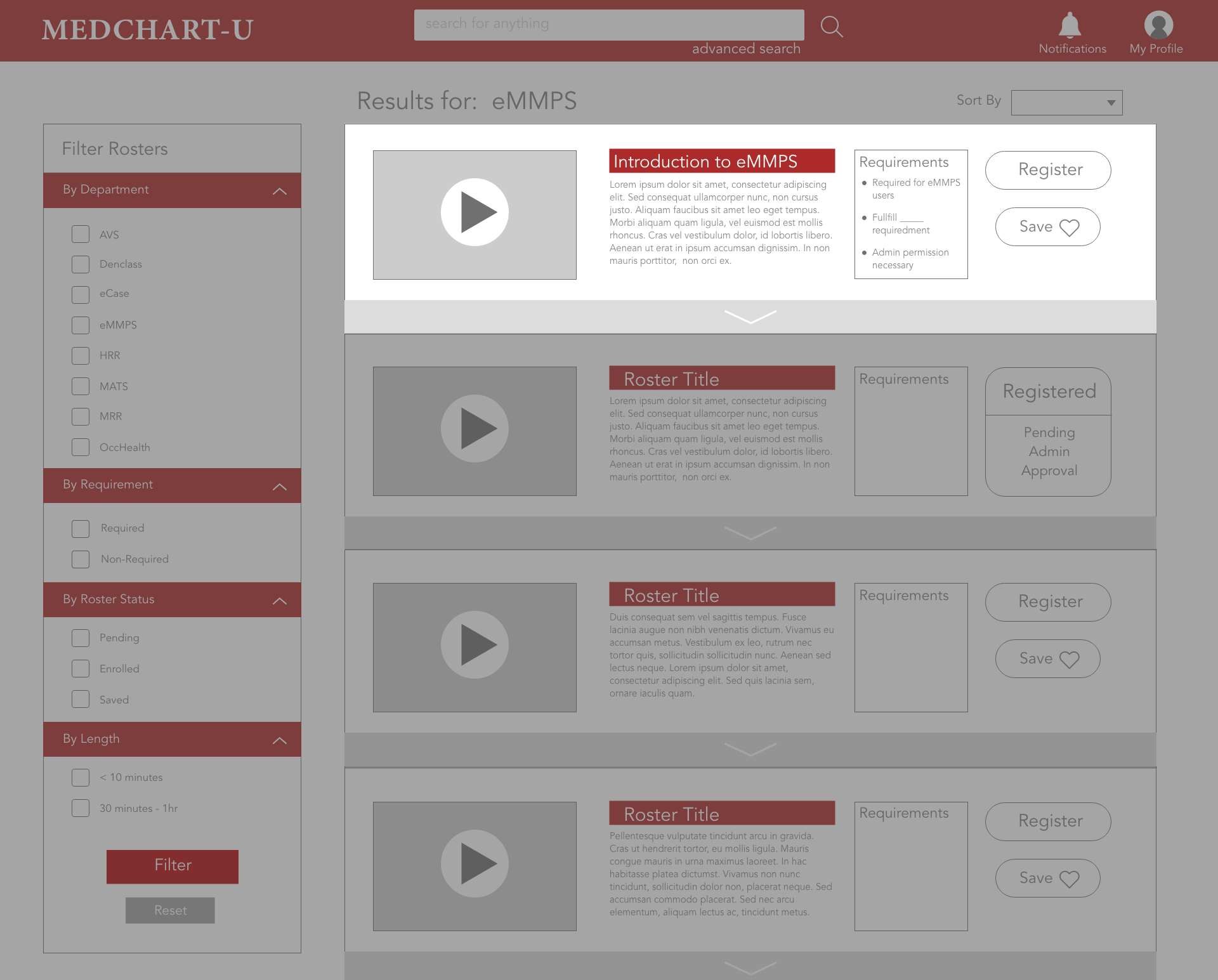
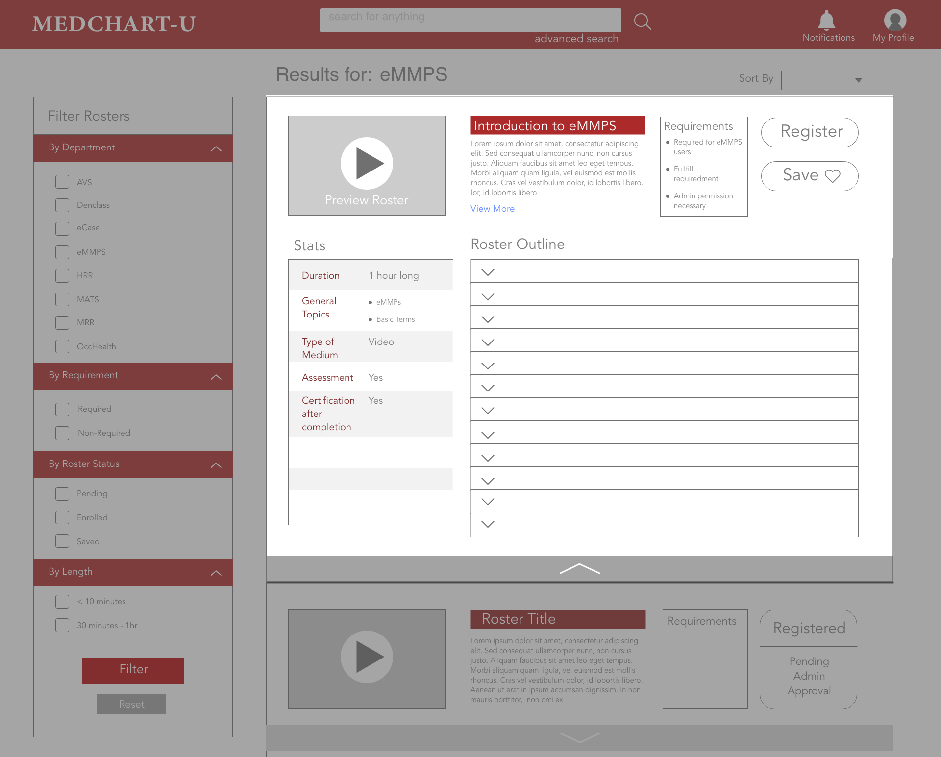
Merged the two main pages: Roster Overview and the Roster Catalog into one page by using a shrink and expand feature so that users would not need to leave the roster results page when browsing the roster catalog.
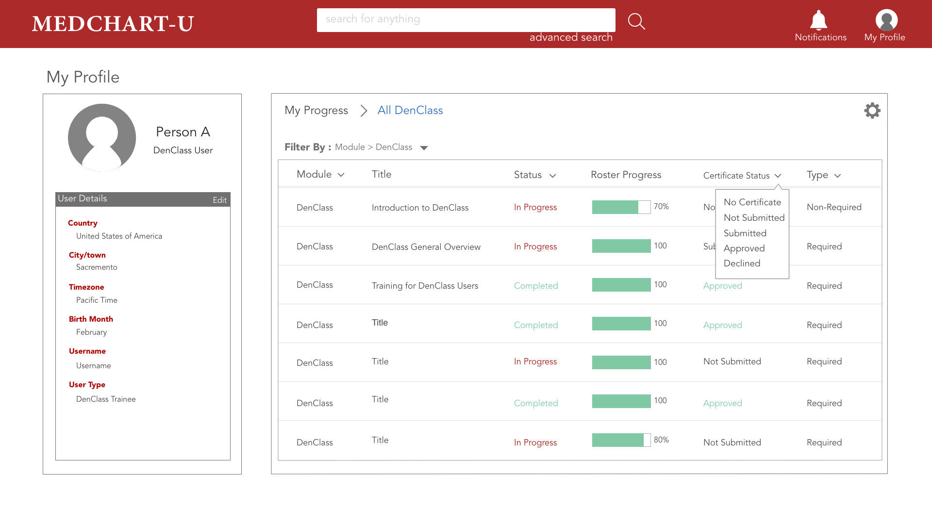
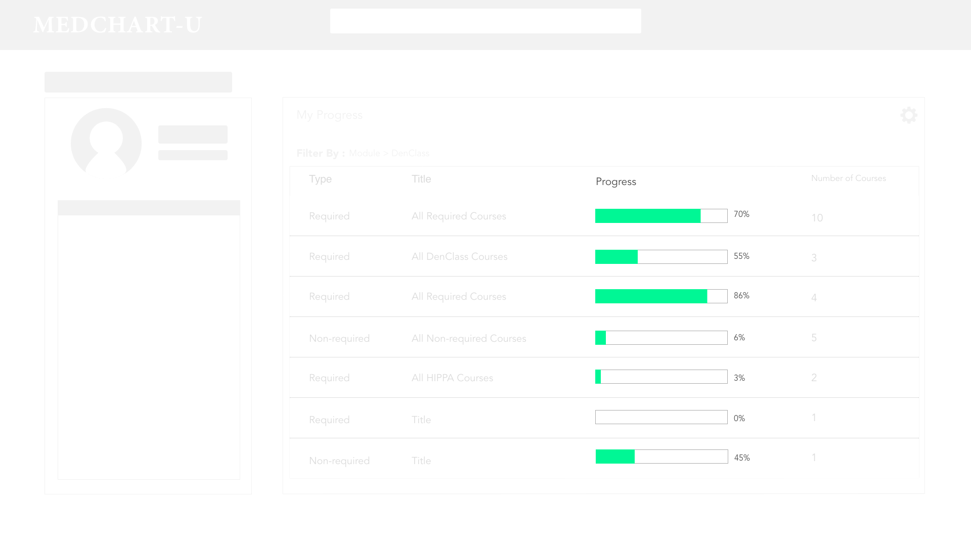
Compression of pages: Joined the My Profile section with the My Progress into one page
2. Personlization: How to create incentive for users of MEDCHART-U? Where to implement progress tracking?
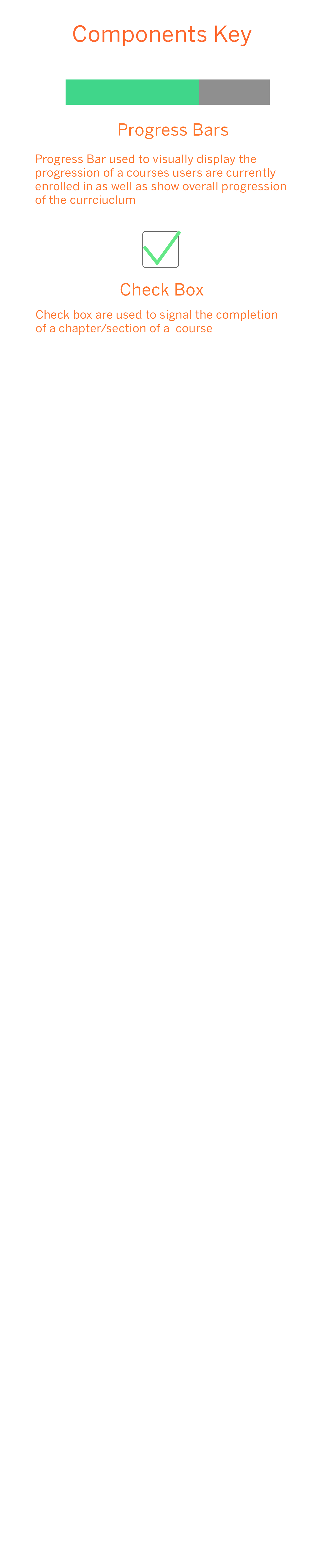
Provided progress tracking elements throughout the website.
Landing Page
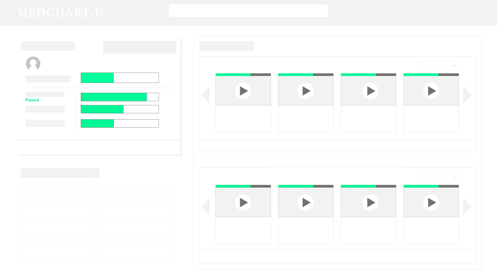
Roster Overview
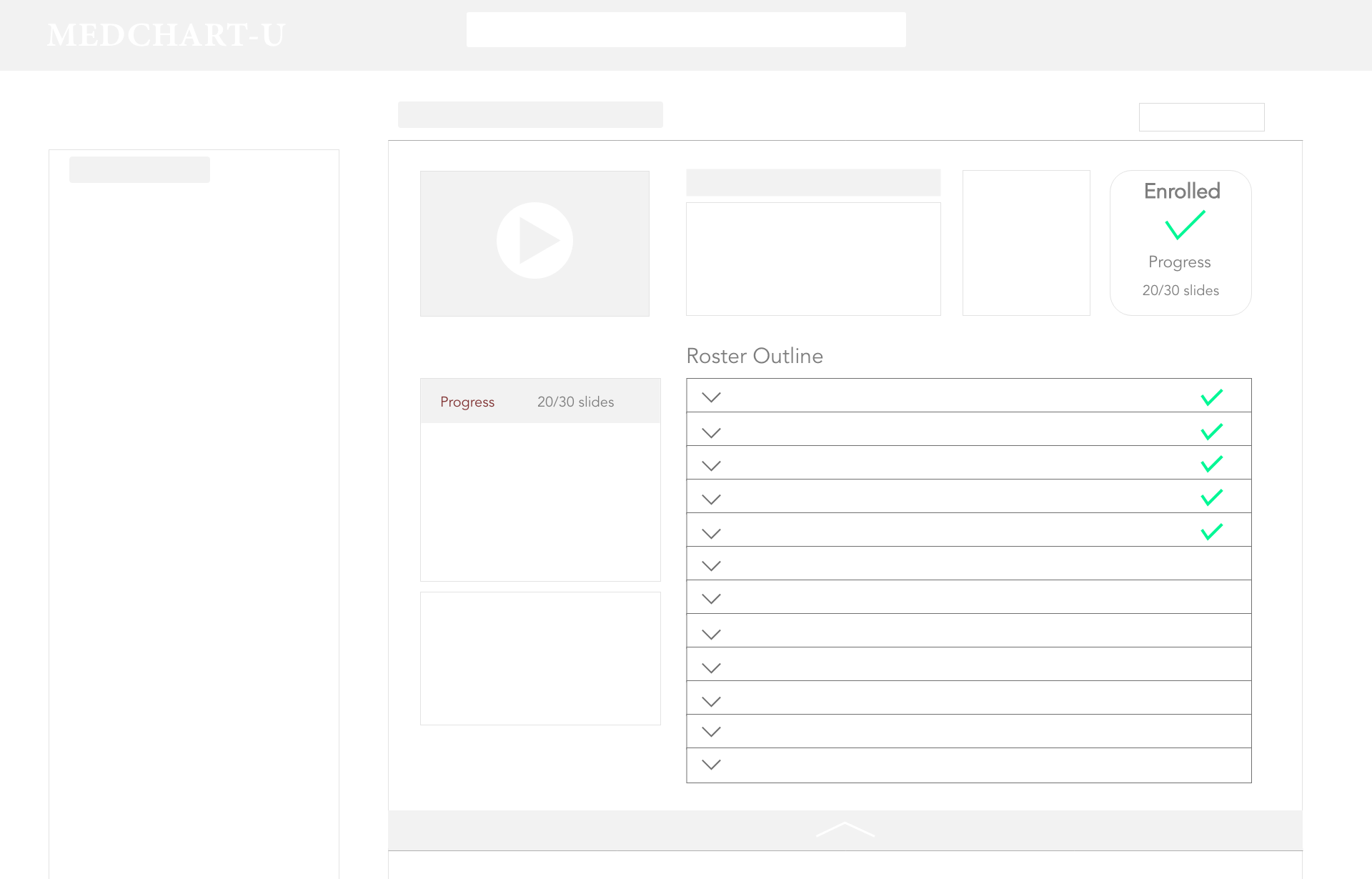
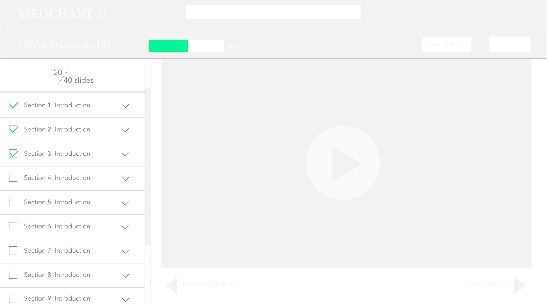
Roster
My Progress
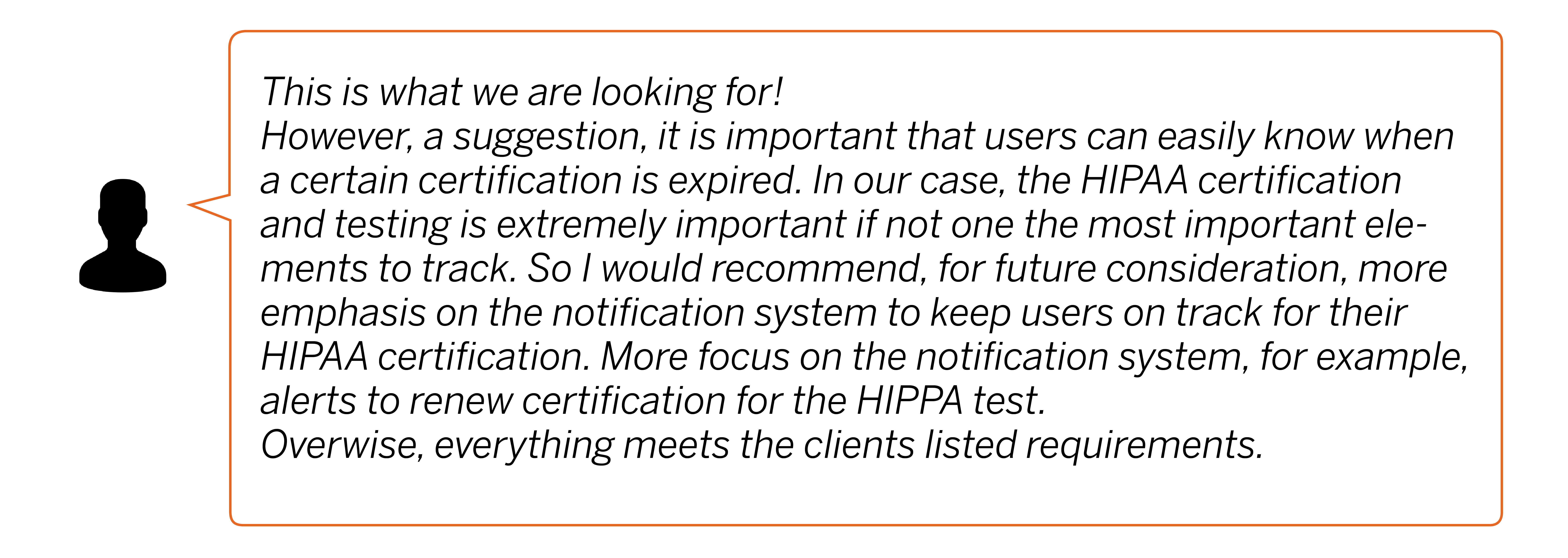
Review from Manager
With the completion of the mid-fidelity prototype, my internship was coming an end. To conclude my portion of contribution to the MEDCHART-U website, I presented my work to the head of the MEDCHART department for critisim and feedback.
Design is vital and sometimes it is an undermined step in the world of developement. There were definitely moments of frustration in which I didn't know how to progress my design with the strict restrictions placed on it. However, iteration after iteration and close analysis, I was able to find a design that our team believes to best suit the users and the situation, a design which satisfied the client and governmental requirement yet provided the most usabilty to the users.
Final Product: MEDCHART-U Mid Fidelity Prototype


